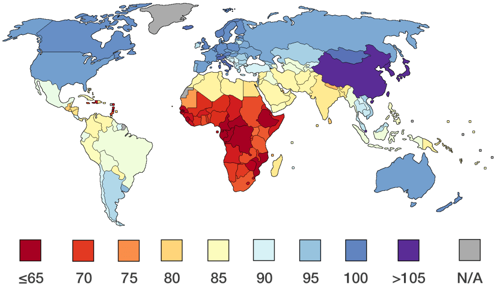
The Bell Curve boiled down is represented by this map. It displays historical average Intelligent Quotient by race and region across the globe. Since the IQ Test was developed over 100 years ago, the amount of variance has been negligible. Many “answers” have been given for the obvious differences in native intelligence. Nutrition, environment, language structure and many others. All I know is this map represents areas of dysfunction very well.
This is a map of poverty. Ignorance. Susceptibility to authoritarian regimes. Bloody religions. Stagnant societies. Reduced life spans. Stunted cultural developments. Every malady known to man is represented in direct correlation to this IQ map. There is one aberration; China. The idea that their average IQ would be 105 is incomprehensible to me. They strike me as a backwards, evil society. Other than China its a perfect roadmap.
In Africa you have grass huts and in South America you have wood huts. No surprise. You look at the 3 areas of the globe that have a functioning society (America, Europe, Australia), and there is no surprise, they were started by civilized white men. Every “stereotype” is reinforced by this map. My theory is twofold. You can’t address a problem until you acknowledge it. And secondly, truth is not your enemy, lies are. I will go to my grave believing that ‘ugly truth’ is better than pretty little lies.
The question that occurred to me as I took a last look at the map is, “Are the red, brown and beige areas capable of self-government?” They haven’t been up to this point.
